
Introduction
Elden Ring is acclaimed for its challenging gameplay and immersive design, yet players encounter significant UX obstacles that impact usability and engagement. As discussions grow within the gaming community around refining user experience without compromising core difficulty, this project aims to research Elden Ring’s existing UX and identify specific pain points.
GOALS
• Map the player's journey from game start to early exploration, focusing on key interactions and accessibility challenges.
• Create wireframes to enhance accessibility in menus, character creation, HUD, and quest guidance; gather player feedback via structured user testing.
• Develop polished mockups inspired by Legend of Zelda to create an intuitive yet unique UI style.
• Identify and recommend accessibility features, such as color-blind modes and high-contrast options.
Details
ROLE
Research | User Testing | Prototyping | Visual Design | UI Art Assets
TIMELINE
8 Weeks
TOOLS
Figma, Photoshop, Illustrator
CREDITS
Disclaimer
This project was created for a UX/UI design course.
Final Designs
The final designs of this project include following screens: Title Screen, Character Creation, Combat/Gameplay, and NPC Interaction Archive.
OVERVIEW
High-fidelity mock-ups of the updated Elden Ring user interfaces in the style of The Legend of Zelda.

Initial Research
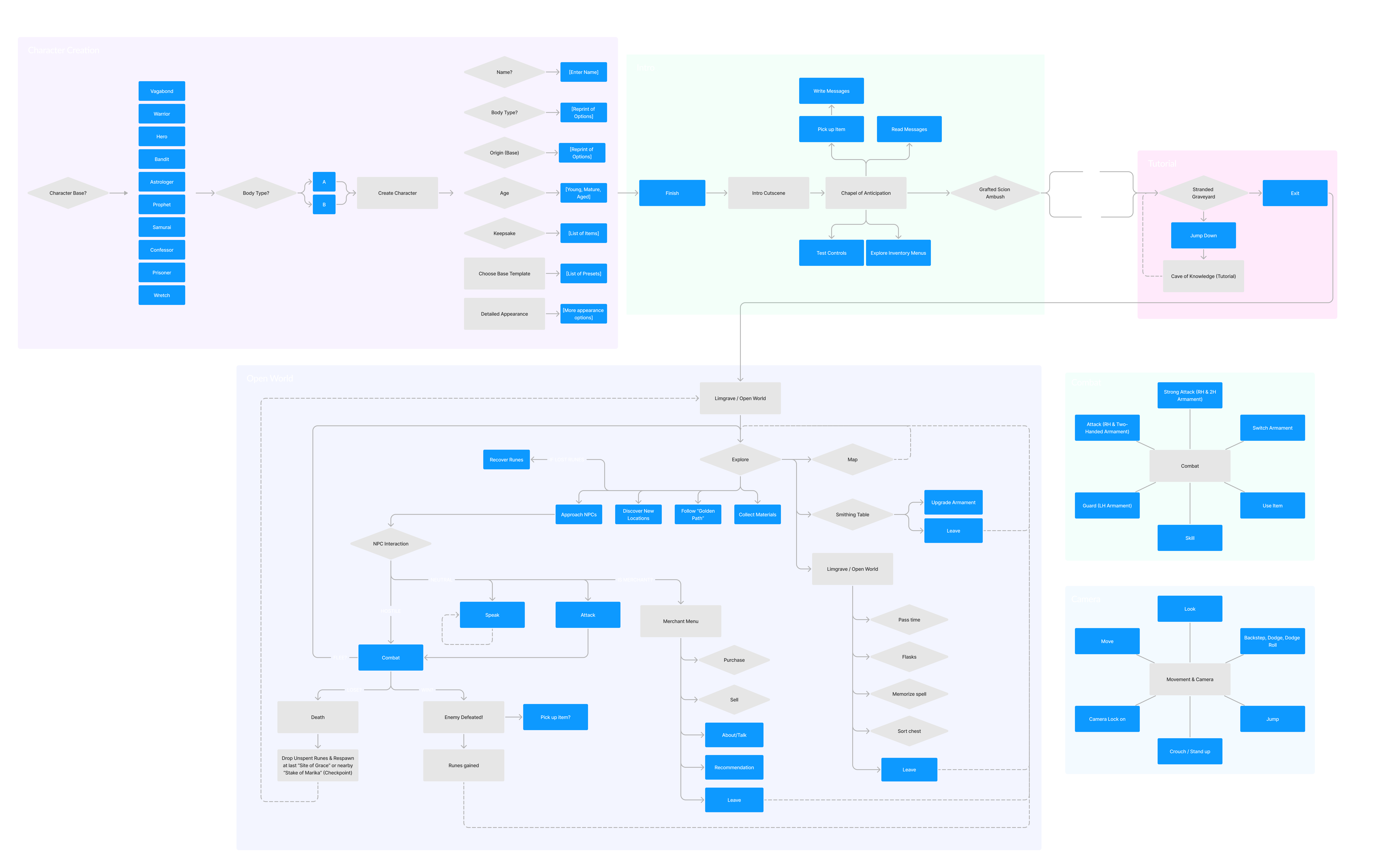
In order to improve the user experience, I needed to understand the player's journey through the game.
OVERVIEW
My initial research involved creating a "paper" prototype map and a flowchart of the user's journey. Additionally, I explored what players have expressed online regarding their experiences with the game.
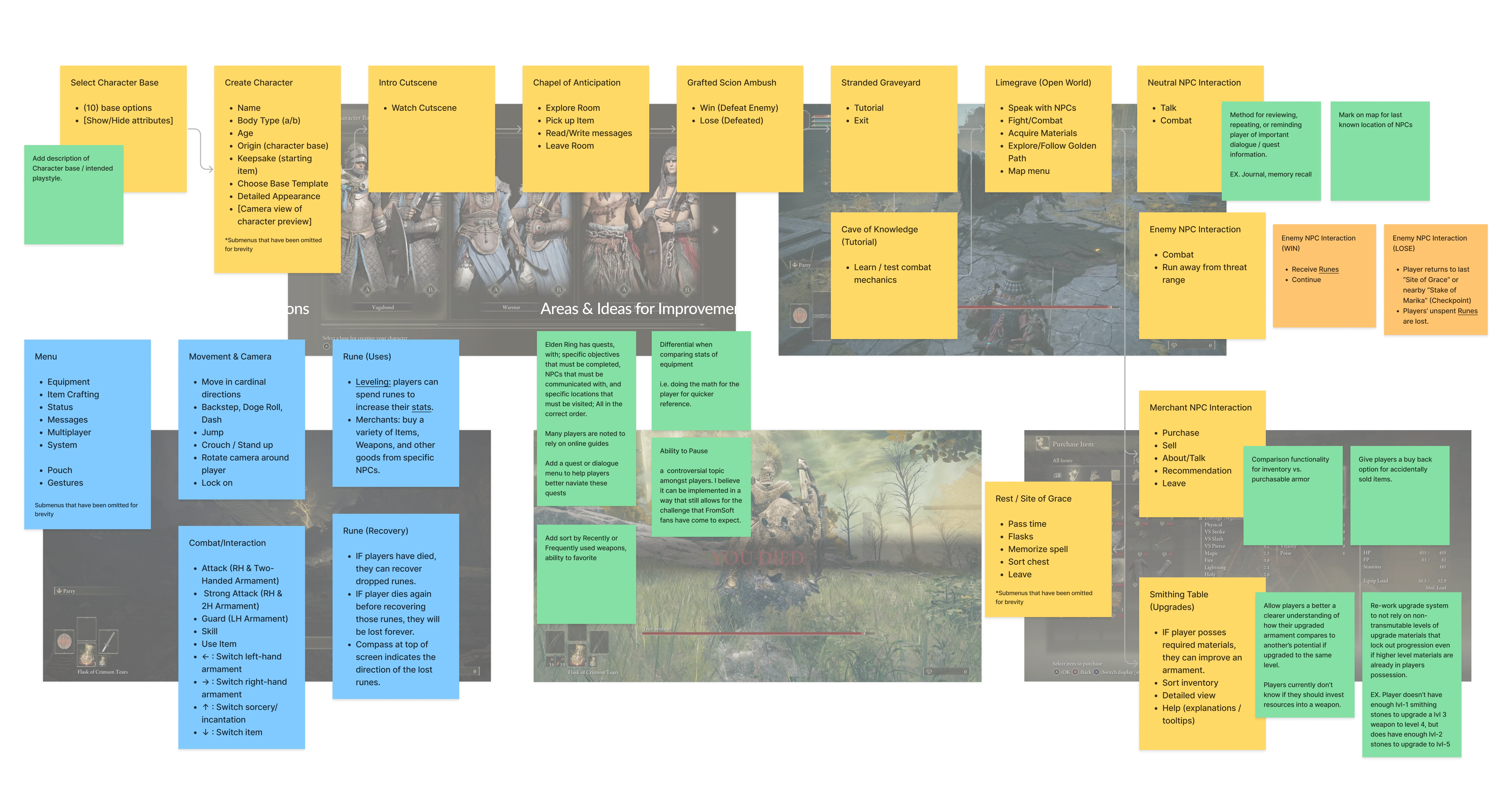
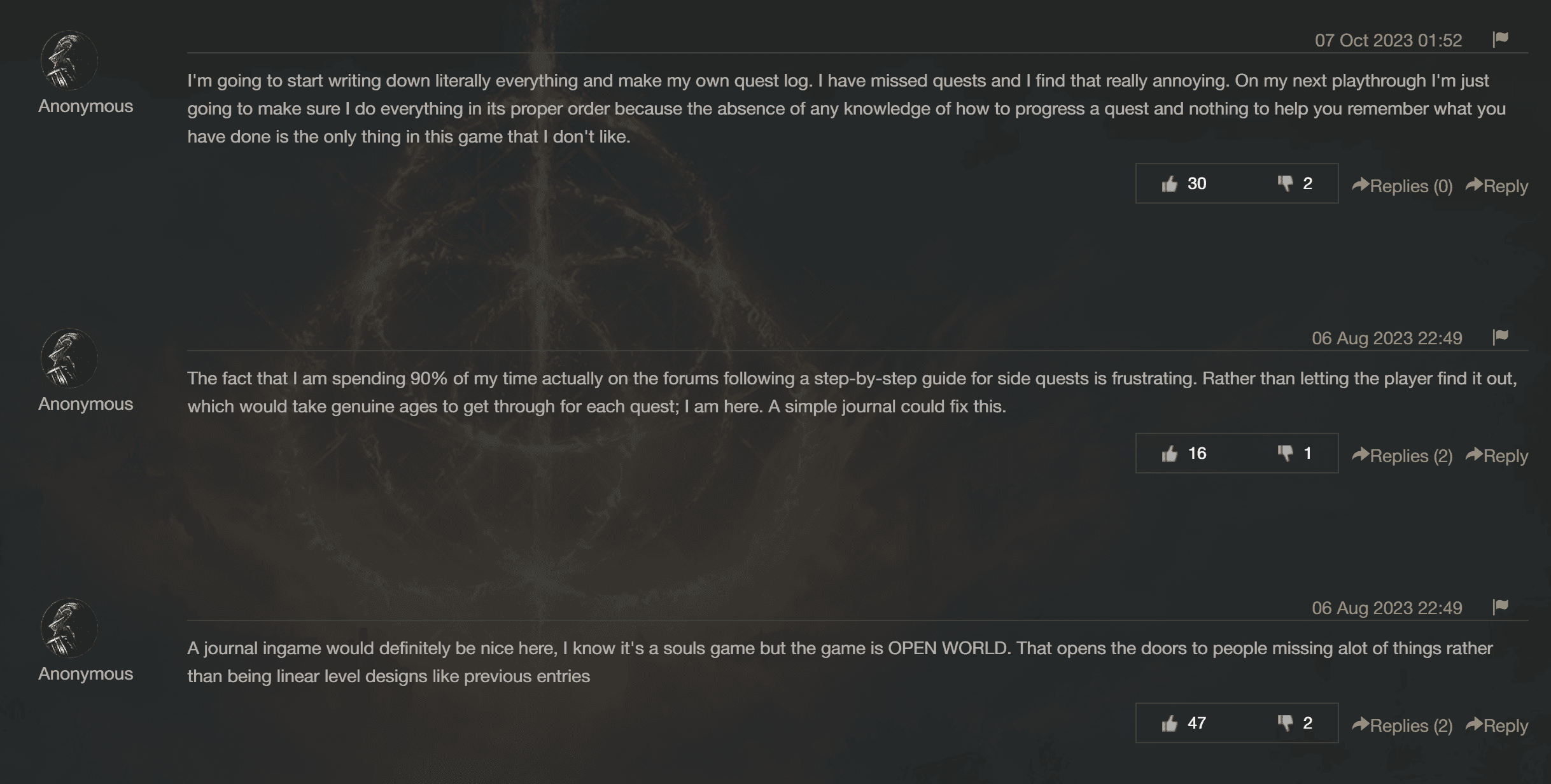
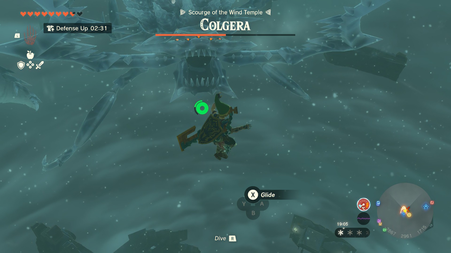
Player's Frustrations with Quest Tracking
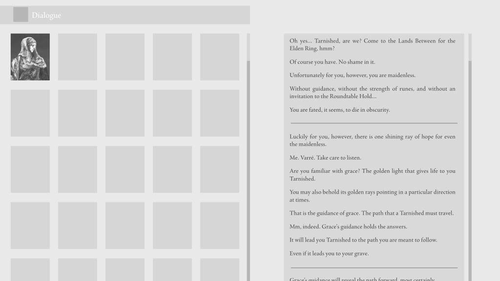
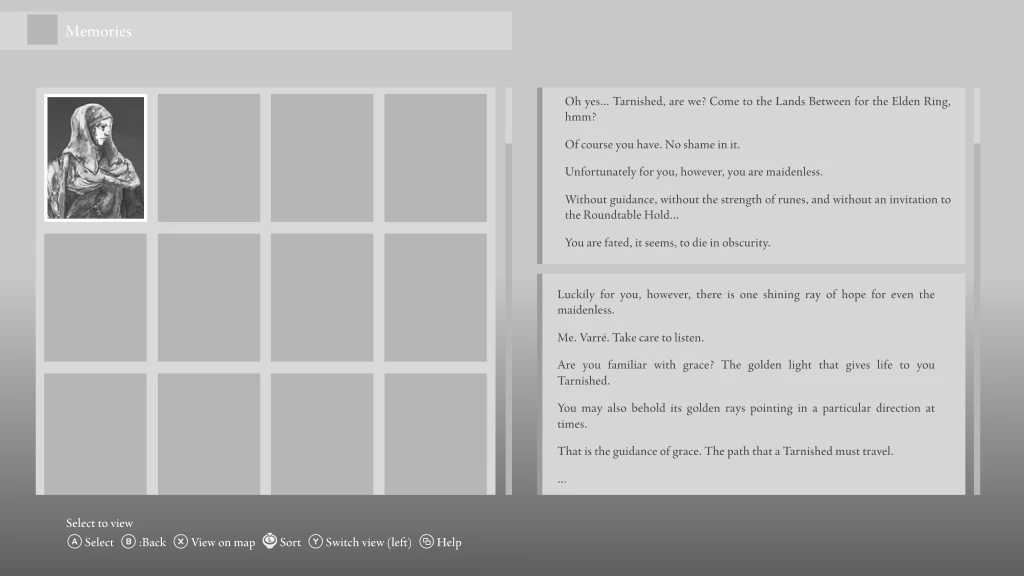
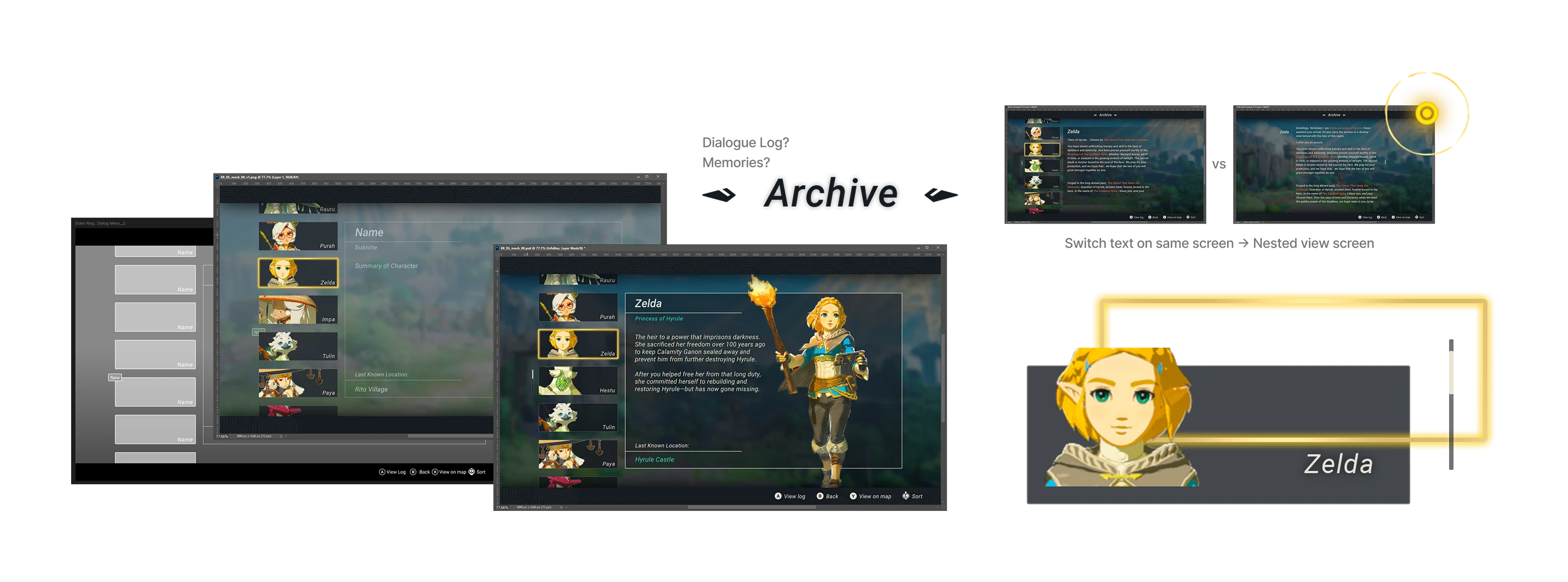
Several forum posts from players express frustration over Elden Ring's lack of an in-game quest log or journal system. Players mention spending extensive time on forums and guides to keep track of side quests, describing how easy it is to miss content due to the game’s minimal guidance. These comments highlight a key accessibility and UX pain point: players desire a way to track their progress without disrupting the game’s open-ended design.
This insight serves as a starting point for deeper exploration in user testing, eventually inspiring the proposed "Archive" feature .
User testing & Prototyping
Creating greybox wireframes and running multiple rounds of usability testing.
Objectives
Evaluate wireframe clarity, focusing on start menu, character creation, gameplay HUD, and dialogue menu.
Determine if players can navigate the start menu, understand character creation options, recognize UI elements, and benefit from a potential dialogue log.
Key Test Areas
Start Menu: Assess preference between original and character-focused design, ease of navigation.
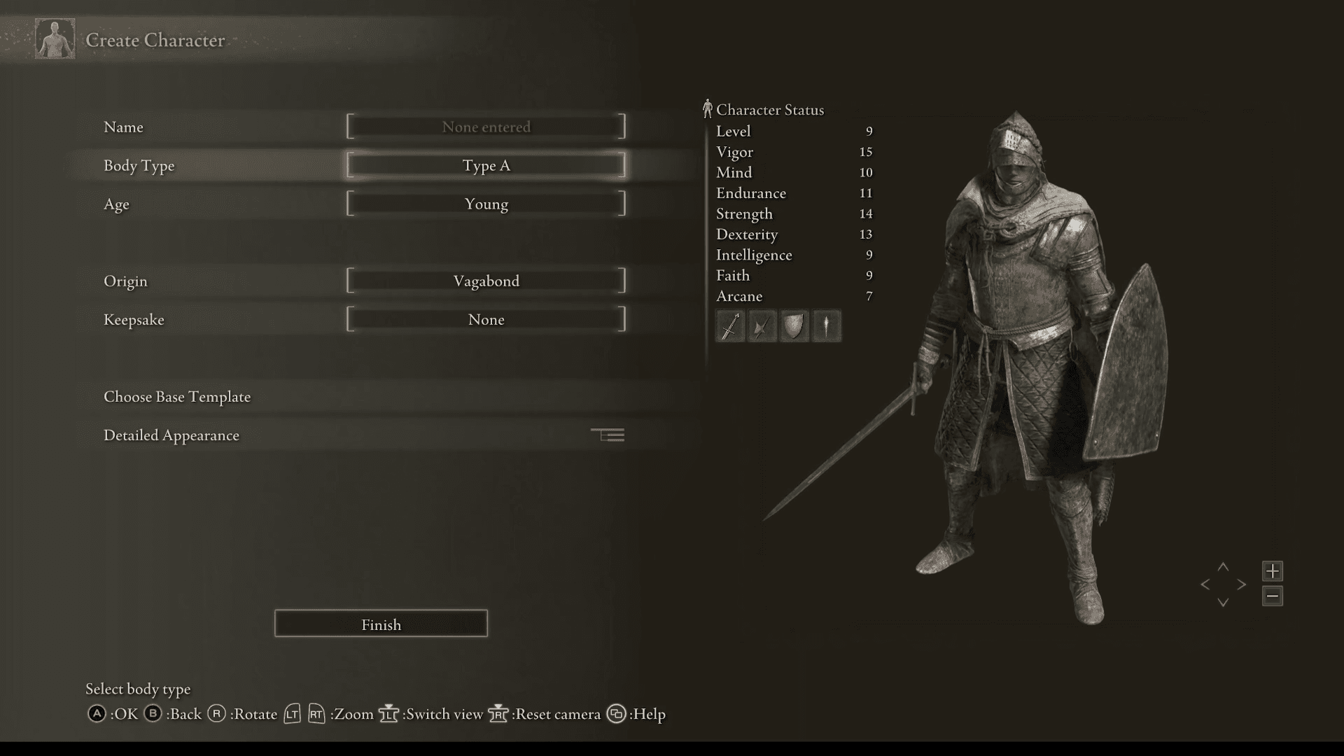
Character Creation: Determine if players understand origin selection and if additional information is needed.
Gameplay HUD: Verify if players can identify all UI elements.
Dialogue Log: Explore whether a dialogue log aids memory of NPC conversations without altering game design.
hIGHLIGHT
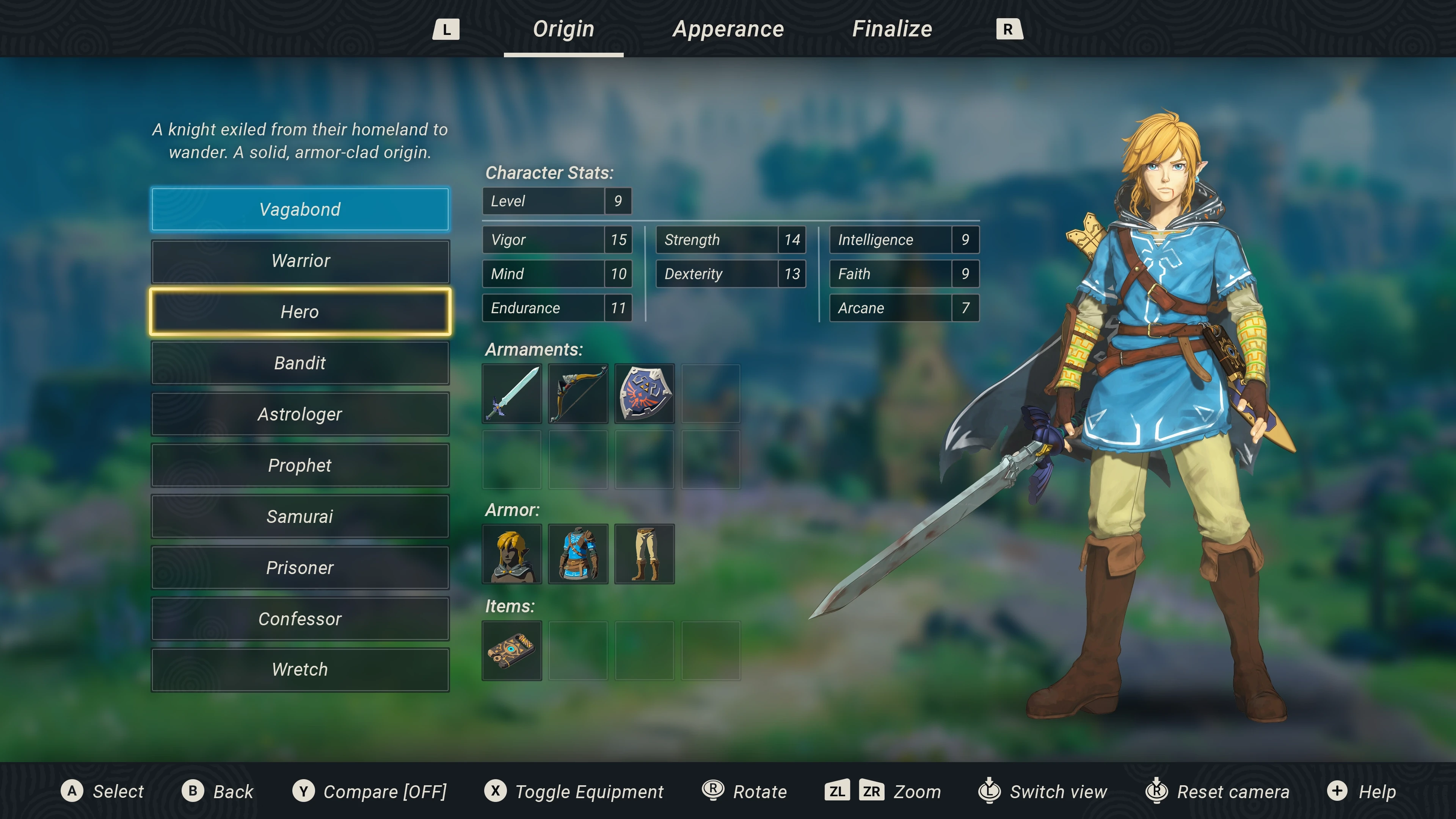
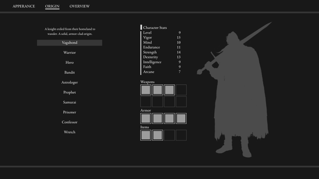
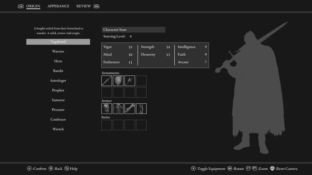
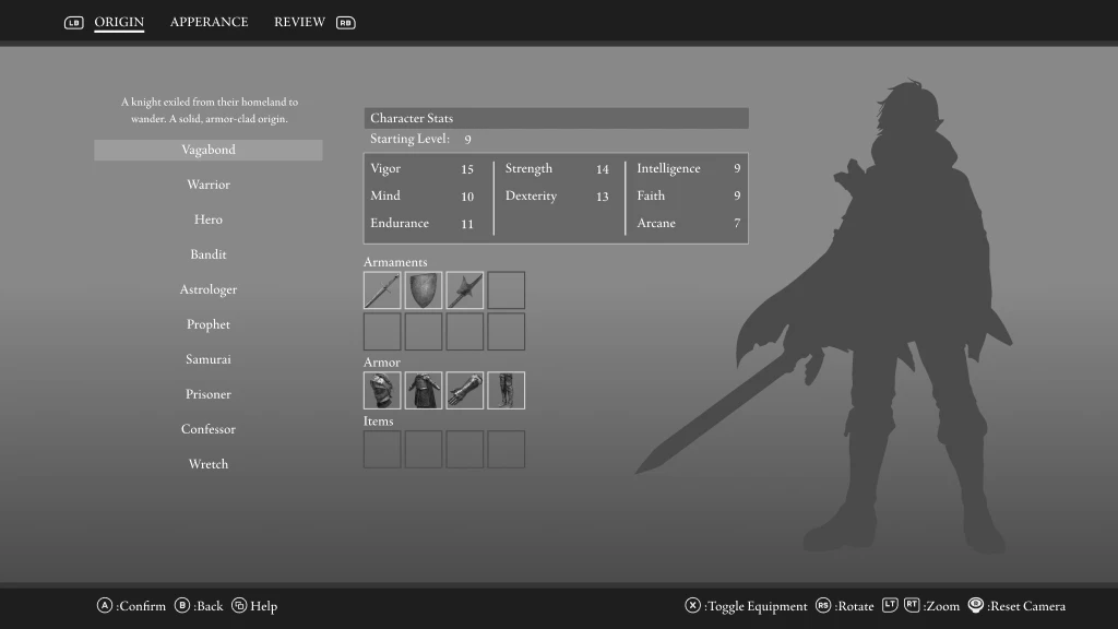
Character creation screen
hIGHLIGHT
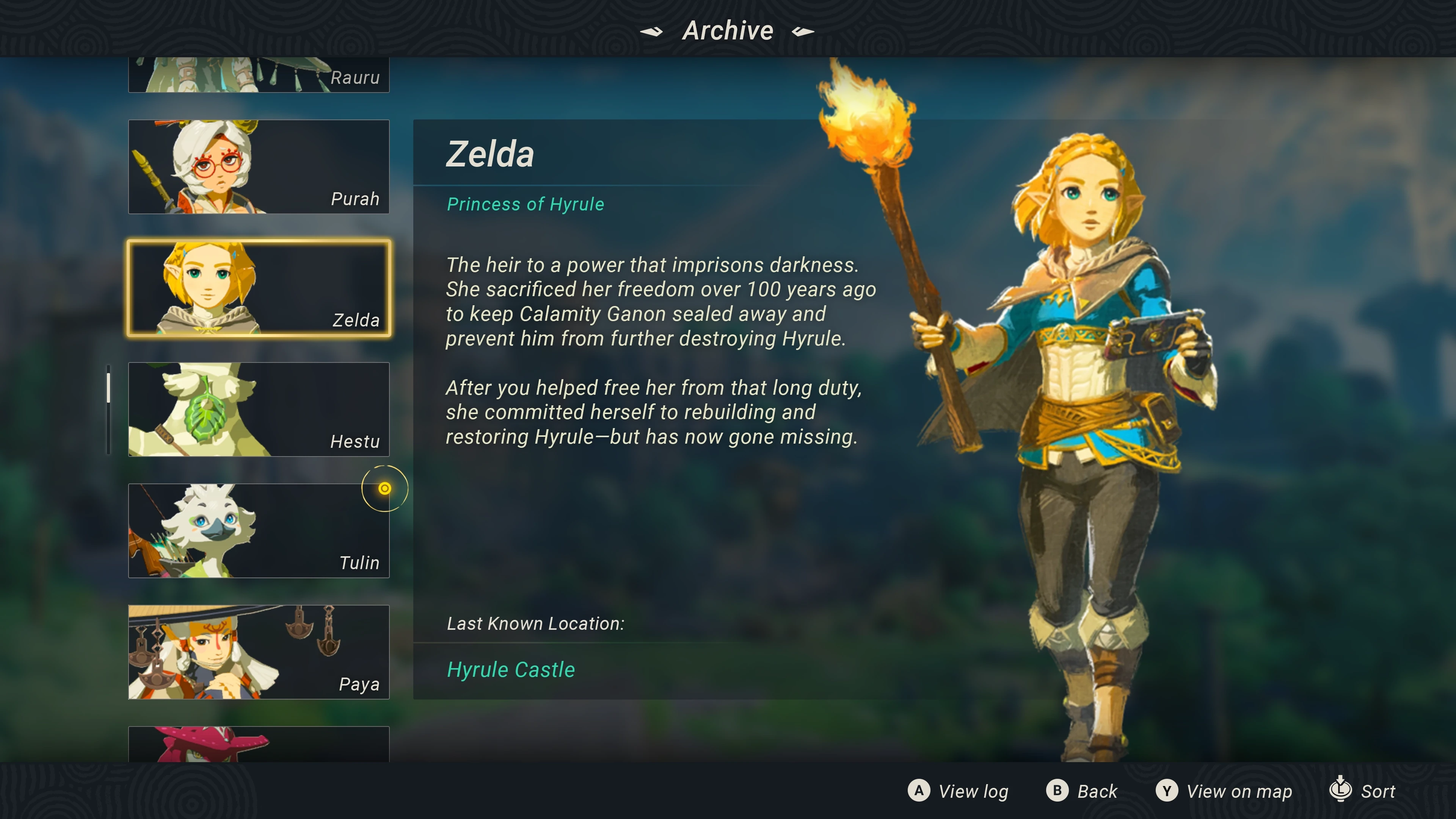
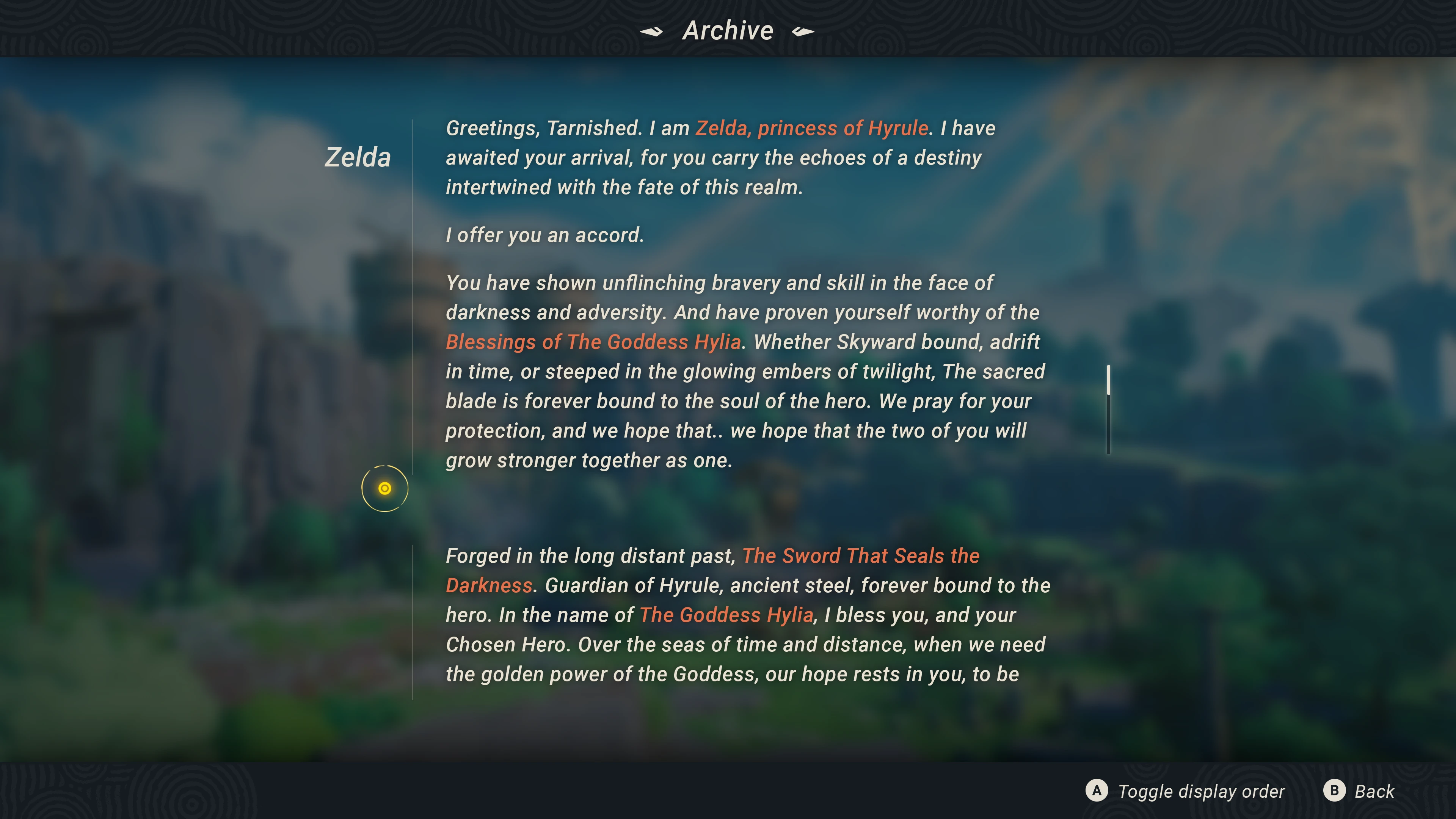
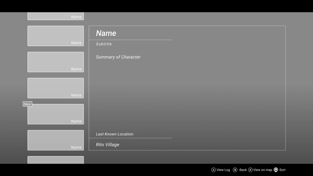
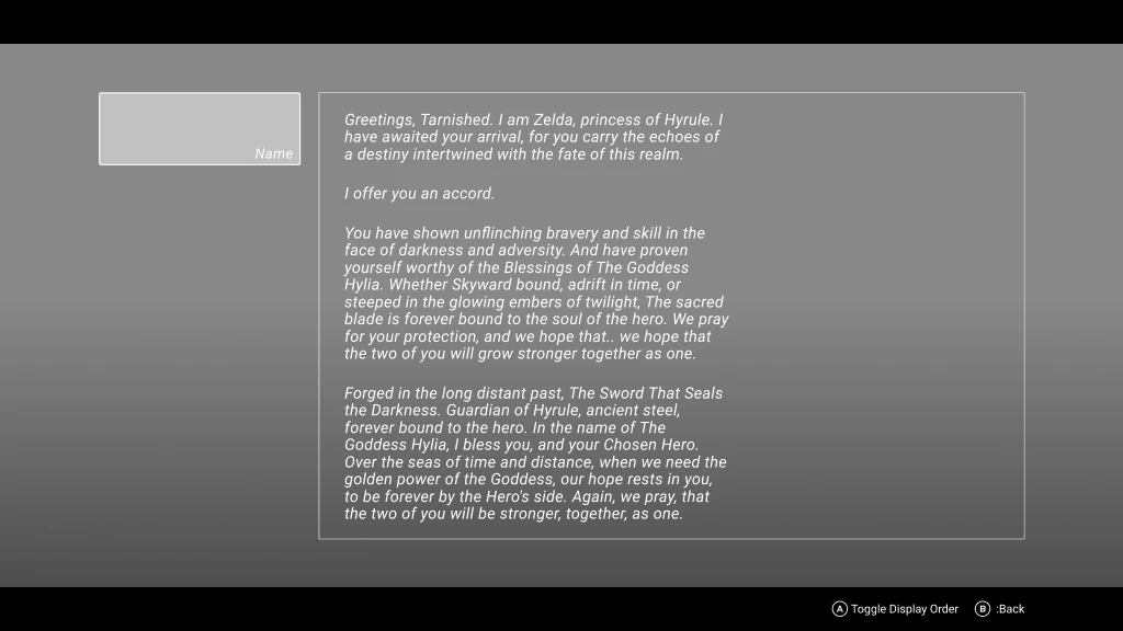
Npc Interaction Archive
Noted Testing Insights
User testing revealed key findings across several interface areas:
Start Menu: Although designed to foster a connection with the character, most players preferred the original menu layout without the character focus, appreciating its simplicity and larger title text. All participants were able to navigate it without issues.
Character Creation: Initial confusion arose from unclear wireframes, especially regarding starting equipment slots. Participants generally understood most elements, but suggested clearer button prompts and additional details on character abilities.
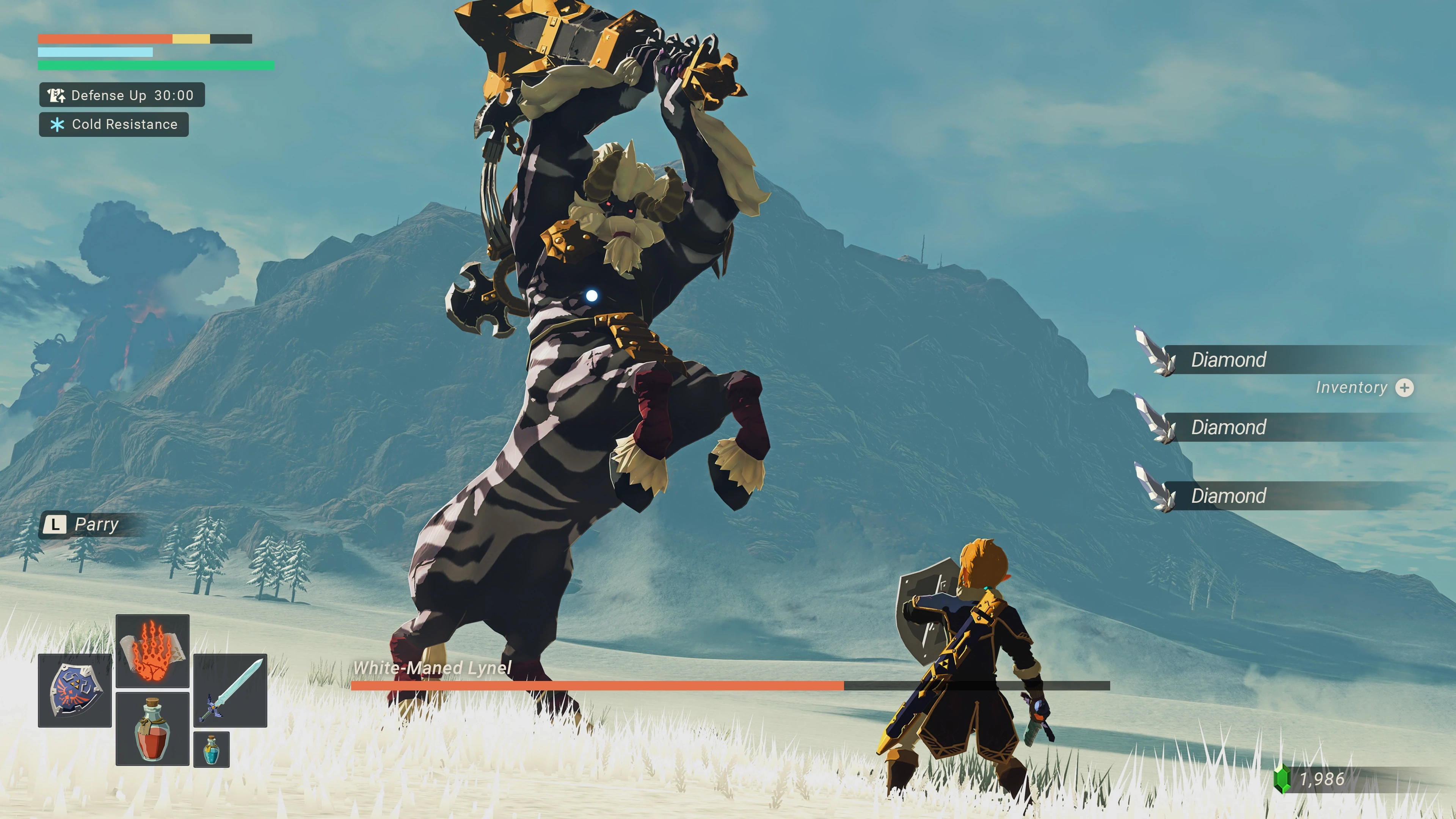
Gameplay HUD: Players accurately identified most UI elements, but further testing on interaction with gameplay mechanics (like weapon switching) could provide deeper insights into usability under active conditions.
Dialogue Menu: Players expressed frustration with the lack of in-game tracking tools, often resorting to online resources when stuck. They preferred a combined "Dialogue/Quest Log" for tracking NPC interactions, suggesting features like NPC sorting and location markers for easier reference. The dual-scroll setup was noted as potentially confusing.
These insights guide the refinement of design elements to enhance clarity, accessibility, and support for user navigation and memory, without diminishing the game’s challenge.
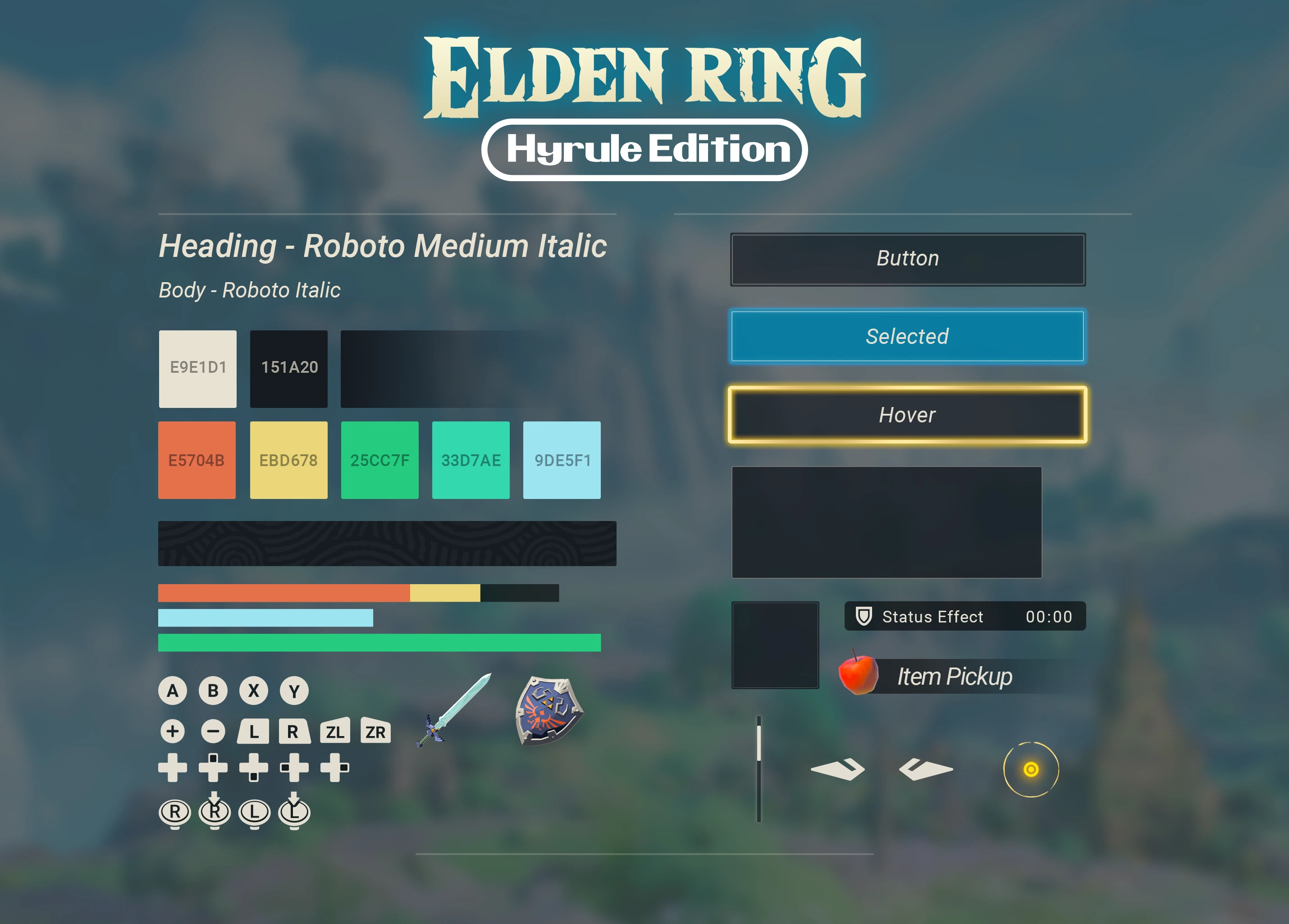
Visual Design
Defining the visual language and creating polished, hi-fidelity UI mock-ups for each screen.
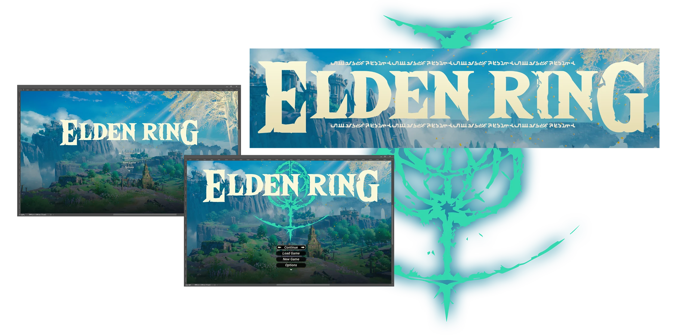
Inspiration
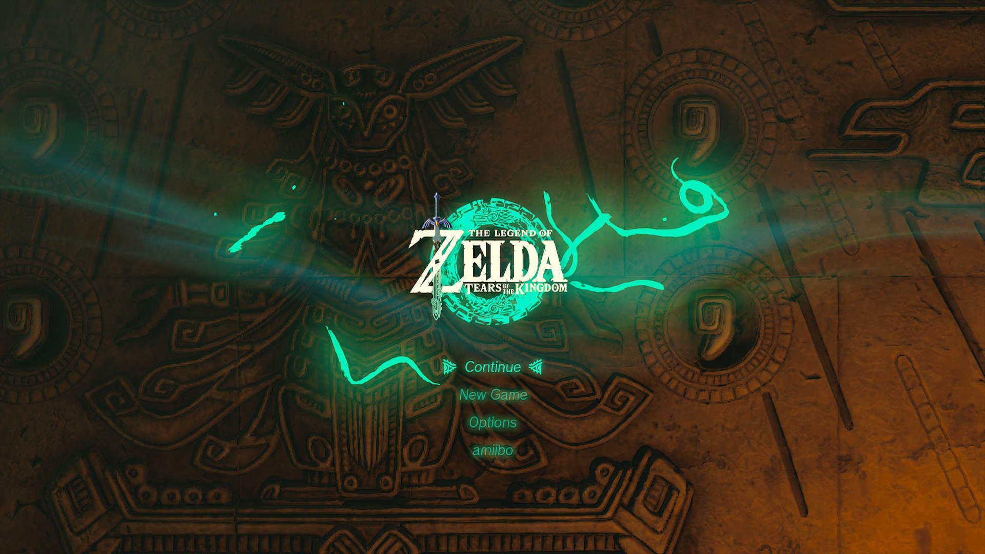
I drew inspiration from Shen Jia's stylized recreation of Elden Ring's starting area, which sparked the idea to hybridize my final designs, blending Elden Ring's gameplay needs with the intuitive, player-friendly elements characteristic of Zelda games.
This approach aimed to enhance accessibility and visual clarity while respecting the game's original ambiance.
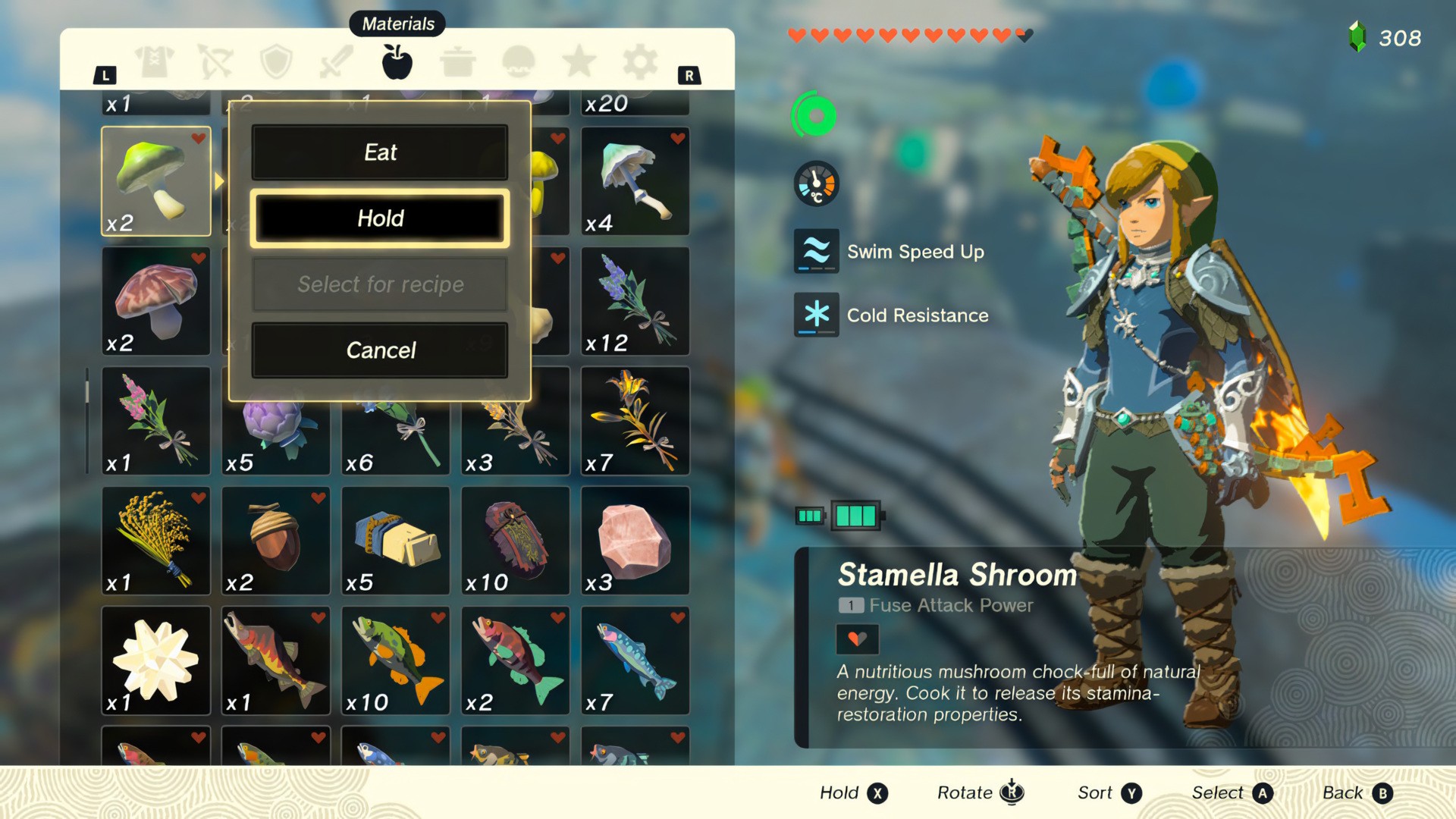
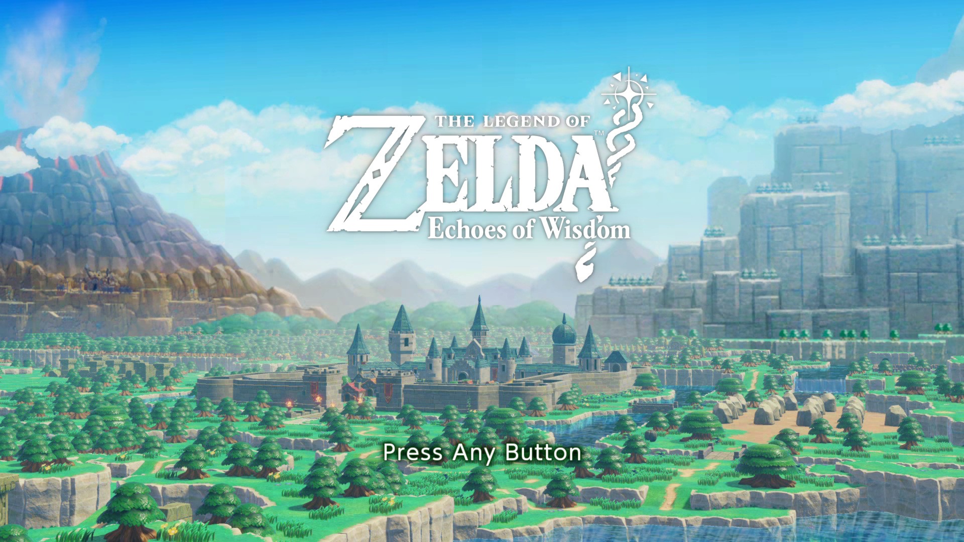
The Legend of Zelda: Tears of the Kingdom, Breath of the Wild & Echoes of Wisdom (images provided by gameuidatabase.com)


Art & Design Exploration


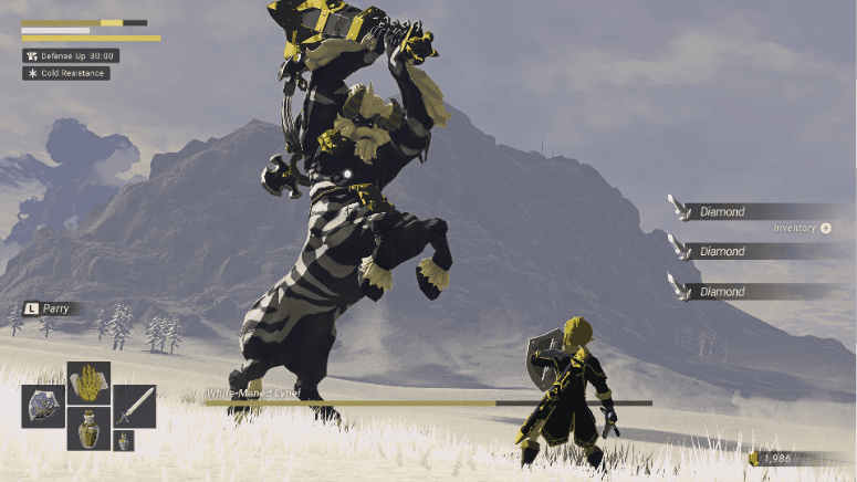
accessibility
Exploring ways to make Elden Ring more accessible while preserving From Software's signature challenging gameplay.
As part of my research, I studied games like Horizon: Forbidden West and Star Wars Jedi: Survivor, both of which offer extensive accessibility options that enable a highly customizable player experience. The follow is a list of additional proposed option to add to Elden Ring.
Ability to Pause (game design vs accessibility)
High Contrast Mode
Audio Customization (auditory gameplay indicators)
Captions & Subtitles
Dynamic HUD scaling
Slow Mode / Extend Combat Timing Window (Controversial!)
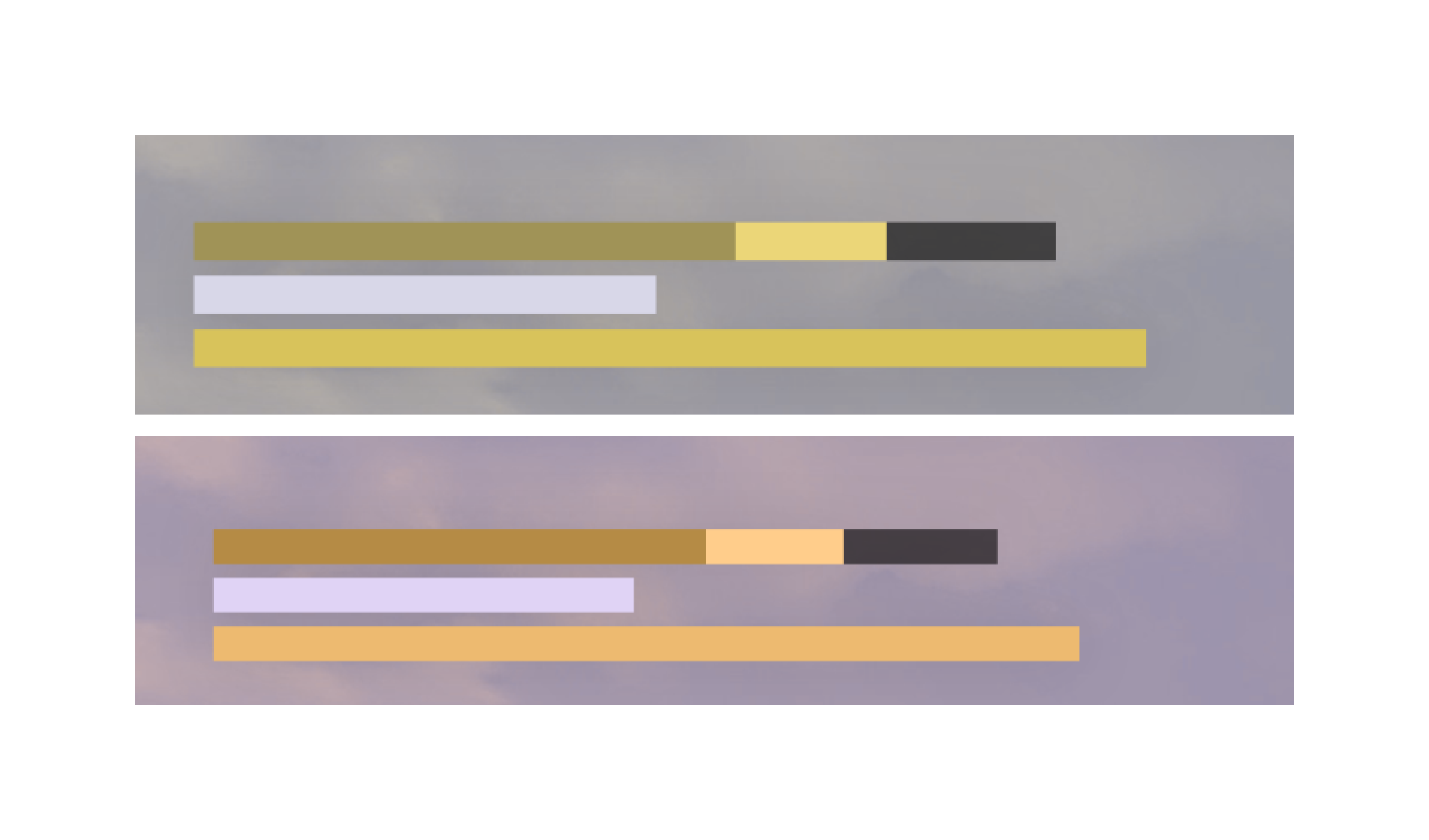
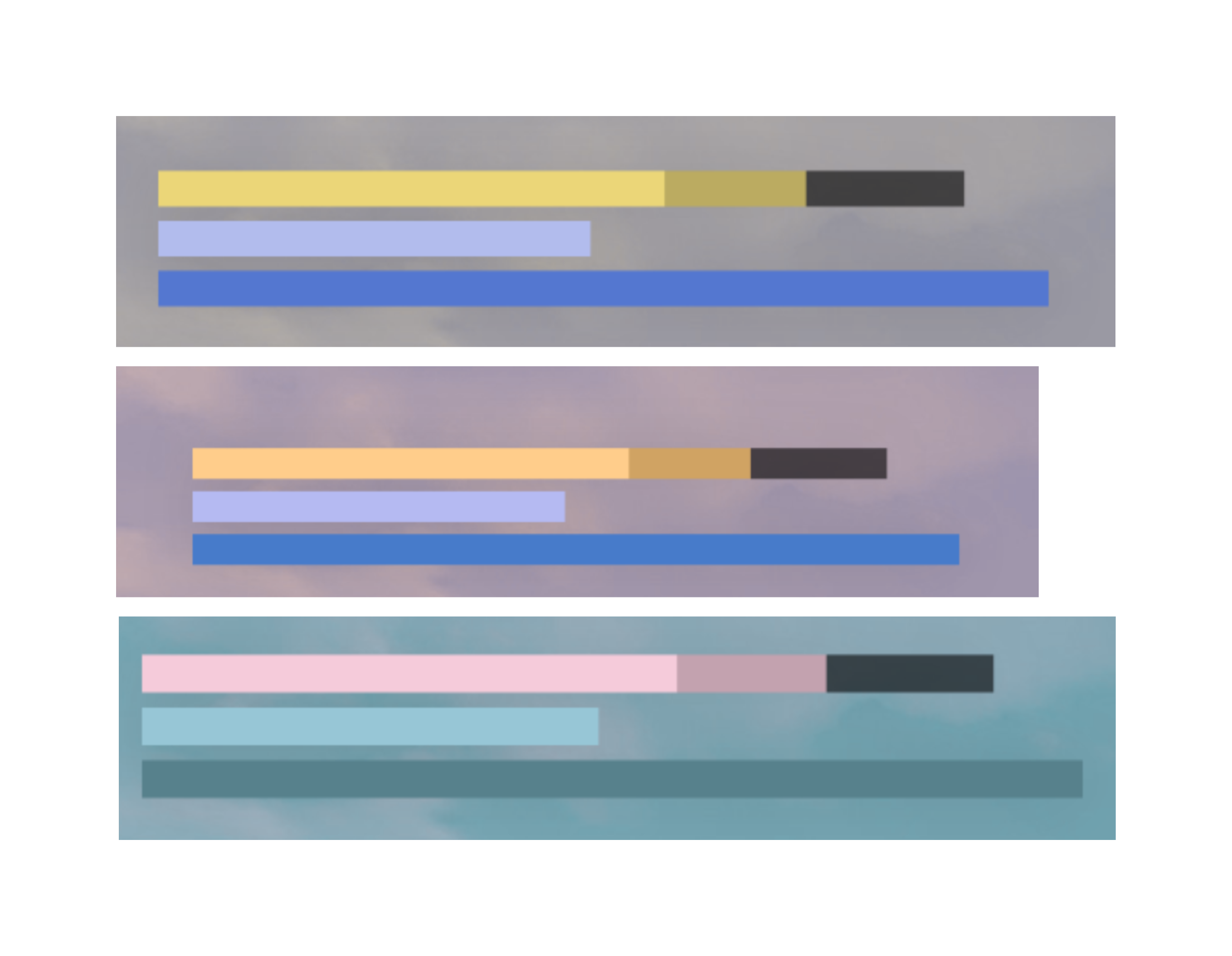
To ensure color accessibility in my testing, I began with a general color palette that works for most players. I then created specific palettes for players with protanopia, deuteranopia, and tritanopia.
Ideally, we would also provide players with the option to choose their own colors for certain UI elements to enhance color visibility and differentiate between them. Additionally, I developed a high-contrast, monochromatic color palette for further accessibility.
Protanopia
Deuteranopia
Tritanopia
Monochromacy
Problem Areas
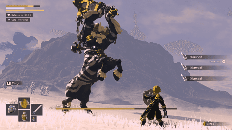
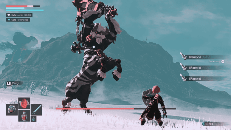
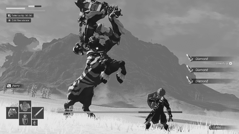
The Health loss indicator and stamina blend together and cause distracting hierarchy.

'FP' and Stamina are too similar

lack of contract between some elements background (needs to accommodate for changing backgrounds/light levels)
Fixes
New color safe pallet
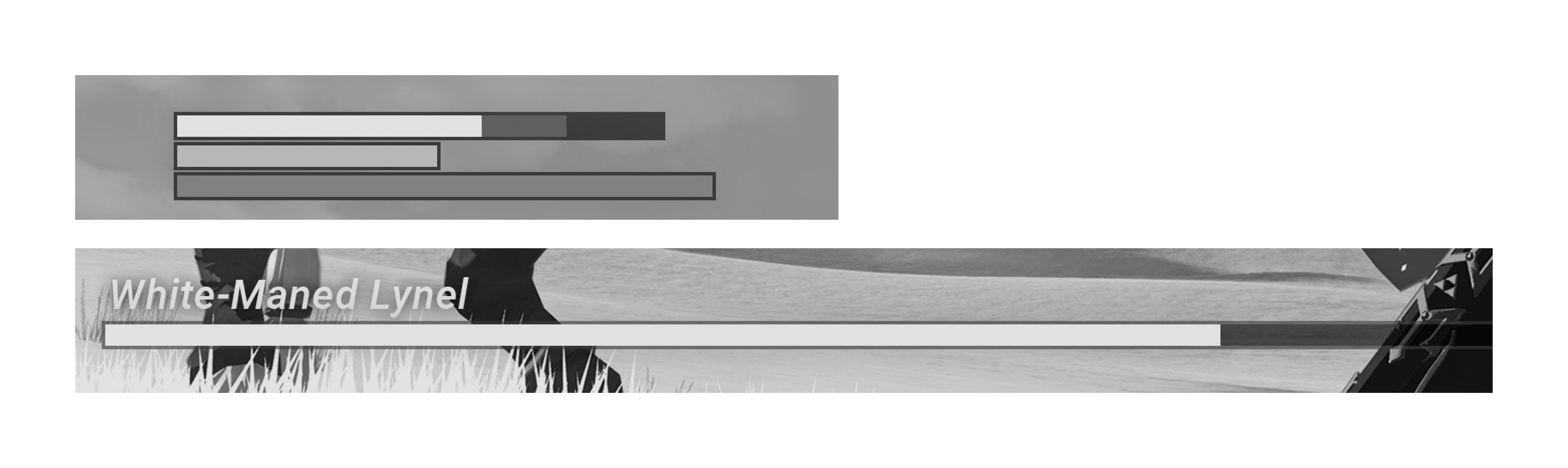
Value changes & borders added to increase contrast
Outcomes & Reflection
Gained a greater understanding of the ux/ui design process in gaming.
Finalized a hybrid UI style, which maintained Elden Ring's distinct game design while enhancing user-friendly interactions.
Validated the new “Archive” feature (a dialogue log) through testing; players found it helpful for tracking NPC interactions without detracting from the open-world experience.
Improved start menu and character creation screens based on user feedback, resulting in more intuitive navigation and clearer presentation of options.
Demonstrated the feasibility of integrating accessibility and usability improvements into challenging gameplay, setting a foundation for broader inclusivity in future Elden Ring projects or similar games.